Last year I finally delved head-first into the wonderful world of Processing. It was one of those (many) times I could college as an excuse that allowed me to spend some more serious time with something that wasn’t directly related to what I do on my day-to-day work. I used the time to create some small experiments to learn the platform, and to help some colleagues with their Processing-based graduation projects – that is, never creating something final, or by myself, other than random experiments.
That’s why when the São Paulo-based band Omega Code started their open poster contest I knew that, instead of using normal illustration editors, I wanted create an entry using Processing. Additionally, my previous experiments were all based in video or real-time functionality, so creating a poster – static, high-res – would be great for a change.
The first idea that popped in my mind when I thought about what I wanted to build was that I didn’t want to use any kind of external asset; so no image composition or anything, I’d do it all with typography.
I did have to use one image, however. I created a black&white version of their template document, which contains the band logo, to serve as a guide of sorts for my poster.

Omega Code poster template
Basically, this logo is used as a map for where I want to have different colors.
The second idea was what to use. Now, I’m an atheist, but I know from Xenogears Fallout 3 that the whole “Omega” thing comes from The Book of Revelations, and I figured the text of that chapter of The New Testament would fit the poster (and the overall concept of the contest) well.
I went to look for the Biblical text and, thankfully, there’s no shortage of Bible-based content on the web. More precisely, I found this website which contains the full text of all chapters from the Christian Bible, including the one I wanted, the Book of Revelations. And what’s best – in its original language.
The one I wanted was written in Greek, however. That poses a problem, since most fonts – including general use fonts like Arial – do not include the glyphs needed for proper Greek rendering. So it was with a big surprise that I found Gentium, a font made specially for Greek rendering – and with a free license to boot – that I could use for the poster. It looks beautiful, too.
With the ingredients ready, I went on to create the poster by writing Processing code.
As strange as this sounds, the most difficult part was actually getting the text rendering to work.
I created a text file containing the entire Book of Revelations, and created a quick sketch that could read random words from it and render those to the sketch area. The problem wasn’t in reading this text file, or getting UTF-8 based strings to read and write properly. The real problem was with getting them to render correctly at the sizes I wanted. This is because processing renders text as images, as is the norm with platforms that are meant for realtime graphics. That is to say, you have to generate raster image “tables” from true type files, posing a problem with quality: too big of a text, and it’d be blurred; too small, and it’d look awful.
Of course, I could generate different font files, one of each size of the funt, but since I wanted to use all kinds of text from size 5 to 300, this wasn’t entirely feasible.
The first thing I tried was to find some Processing library that used text as vector data – meaning it could work like, say, Flash, where you can scale text to your heart’s content without worries about quality. This proved a big problem, however, as the two such libraries I tested had problems of their own – incompatibilities with the Processing version I was using, I suppose.
In the end, I gave up on trying to use different libraries and went back to Processing’s original font support. I ended up doing something absolutely awful – regenerating the font table to memory every time the font size changes. Since this was all meant for a high resolution, non-realtime poster, it served its purpose well, but it was really slow. I started caching the fonts for each size after a while (at the expense of a lot of memory) and restricted the available font sizes to 50 variants, and this made things faster, but still this wouldn’t be possible for realtime text rendering.
With all set on the text rendering features, I went on to creating the actual poster. The first thing I did was write the start of the chapter on the background, as some simple, running text. This was meant to give some texture to the poster’s background.
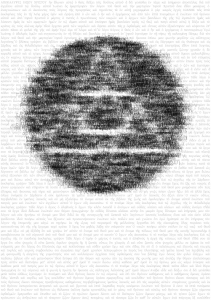
Then I made the sketch read random points from the “template” map (the one in black and white). If the result was a black point, it’d paint a random word on that same position on the final image. The result was as such:
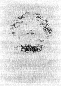
This worked, but it wasn’t really what I wanted yet. I wanted something a bit more random, to give it more texture, even if always type-based. I made it randomize the size of the text as well too, and made it so that if the source background was white, the stamped text would be a very transparent black instead of simply ignoring that point. This was the result:
Still not quite what I wanted, I made the algorithm check the template image to find the brightest color from the entire square that the new word would occupy (instead of just the center point). Now, I’m the first to admit this was done in a very dumb way – it runs the entire perimeter of the text bounding box, checking for the color of each pixel – but it served its purpose well, and heck, this was for a non-realtime sketch, I could afford to be optimization-challenged.
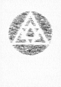
After implementing the box color checking feature, this was the result:
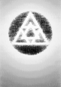
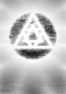
After solving a few problems that would get the random font sizes to get stuck in the same size forever, I decided to add some more features to the background. For a first pass, instead of being fully white, the further from the band symbol’s center the new word was, the darker it would become – this would give the impression of a white glow around the band’s symbol. After running the sketch for a long time – it added a few words every frame – this was the result:
Despite having way too much solid gray, that was almost the result I wanted. Next, I added some better pattern to the background, by making the text color actually vary depending on its angle from the symbol’s center, creating the impression of rays coming out of the symbol. This was the result, still in grayscale:
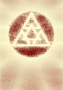
Finally I added some color to it. I didn’t really want to make it too colorful, and after testing with the above image in Photoshop for a while, I came up with a combination that gave it the impression I wanted, of some sort of thing that’s coming out of an old book or printed on an old paper.
The above image also shows a slightly different color detetion algorithm, as I made the text color detection a bit erratic (by using a smaller color selection rectangle). This was meant to make the logo look tighter, even at the expense of the precision of its forms. This is subtle, but I think it looks a lot better.
The final step was generating the image to be used. This image was supposed to be pretty big; thankfully, I build the sketch in way that it’s based on a global scale variable, so while the tests above were ran on a smaller version, I could simply change the scale and let it run to create the final image.
Like I said, the sketch generates the final poster by adding new words to it on every frame. The sketch adds 5 new words on every frame rendered, and runs the sketch for 20,000 frames (because I found the ideal result with 100,000 words randomly placed). But since it’s manipulating a image with dimensions of 2953 x 4185 pixels, it’s a rather slow process – the final image took almost 3 hours to be generated (see this video to understand how it works).
And heck, there’s even a Twitter log with more test images if you want to see them, as I was posting to it while I was working on the final poster.
The final result is pretty simple, visually speaking, but I think it solves the concept well. And while it uses an image as its base, it’s still entirely based around typography, as even the background patterns are created by adding a lot of text with low opacity, so I think it responds well to this self-imposed restriction too.
For more information about the poster, see all fan-made entries to Omega Code’s poster contest, including the above one. The contest goes until March 31, and everybody can send their entries. You can also see the original posters, made by several renowned designers.
This entire post was made because I wanted to explain what the poster contains, and specially because I wanted to make the Processing source code available: download it here. It includes all assets used (font file, image map, and source text file). You’ll obviously need Processing to run it.
Caveat: the above is exactly what I used, and I did try a lot of different things during the development process, so it’s a very non-optimized, non-cleaned up code. There’s a lot of strange things there, like old lines and functions that are commented out, some rather confusing equations, it only uses one class, and all that kind of stuff that a coder does when he’s writing for himself. But it works: press space to hide/show the final result, or S to save the image. It also saves the image automatically every 1,000 frames (or 5,000 words). And feel free to make new entries to Omega Code’s contest based on it if you so want, or of course, create entirely new submissions.

Cara, realmente achei interessante isso. Dei uma olhada no site e tem coisas impressionantes *MESMO*. Pergunta: coisas como o clipe do Radio Head, feito com data visualization podem ser feitas com Processing?
Parabéns pelo trampo!
Fala Eric,
Lógico. É assim que as coisas são feitas. O Processing é um meio-termo, tem plataformas mais complexas tipo OpenFrameworks ou C++ direto, mas o resultado é o mesmo. Vê os testes que o cara do flight404.com faz, tem bastante coisa de Processing na mesma linha. No site do Processing mesmo também tem zilhòes.
// Use createFont and size smoothly however you want.
PFont myFont;
void setup() {
size(500, 200);
myFont = createFont(“Arial”, 32, true);
}
void draw() {
background(0);
textFont(myFont,mouseX); // any fontsize you want
text(“words”, 10, 200);
}
Jeff: as I say on the text above, the reason why the font is re-created for every new size is to *avoid* resizing the original font, which is based on an image – scaling it up or down loses quality. Running a new createFont() for every new size is works a lot better when creating an image, even if it’s sort of a brute-force, slow solution.