
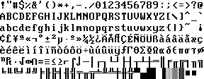
About 12 years ago I created a font called Perfect DOS VGA 437 to be used in a Flash-based ANSI Art viewer (the original post is full of broken links, but the font is available at DaFont).
At the time, I assumed it was a perfect clone of DOS’s Code Page 437, the one used by most western monitors. However, just recently, Adam Moore just published two different iterations on the font called More Perfect DOS VGA 437 and Less Perfect DOS VGA 437. From his page:
Zeh Fernando made Perfect DOS VGA 437 back in 2003, and it is almost the best TrueType VGA font out there. To my eye it looks a bit too spaced-out horizontally; this is for a couple of reasons. I made the following alterations to his font to address them.
First, while his font is done on a proper 9×16 pixel matrix (VGA characters are stored as 8×16 matrices in ROM, but the adapter displays them in a padded 9×16 cell), none of the alphanumeric glyphs are more than 7 pixels wide, which isn’t as it should be. For More Perfect DOS VGA I fixed the capitals T and Z, both cases of M, V, X, and W, the zero, the ligatured AE, and a few other glyphs to better match IBM’s VGA ROM font. The result of this is that some glyphs lie a little closer to one another, which makes text look a little less spread-out.
While I will still maintain that I did a perfect copy of the character as I saw them on my monitor, it’s likely that his glyphs are indeed more correct – after all, I lived in Brazil, and it’s high likely that the control cards used by the monitors I had access to were not exactly original IBM (my whole early computing life was spent on clones of more successful brands, after all). So, if you’re looking for a more kosher duplicate of the DOS fonts seen on the original IBM PC terminal, his are what you’re looking for.
Update (January 19th, 2016): also be sure to check The Ultimate Oldschool PC Font Pack, which includes remakes of nothing less than 81 different font sets (including the VGA font). Thanks rötorhead for the link.
You can’t get more perfect than perfect. It’s like getting more naked. Once you’re naked, you’re naked.
I think in this case “Perfect” is more meaning “Perfect representation”. Mine was a perfect representation of one thing, his is a perfect representation of another thing. Only that his another thing (IBM fonts, rather than IBM clone fonts) seems to be more canon.
Naked without pubic hair if you will.
How’s about this? http://int10h.org/oldschool-pc-fonts/
Pixel-perfect remakes of >80 different oldschool PC text mode fonts… including multiple variants of the VGA font and others.
Absolutely amazing. Thanks for the link.
Hey Mr. Fernando-What is the angle of the “V” letter exactly? On the part which is diagonal and nadir to top? Thanks very much for this info.
Thanks, Zeh! Very, very nice work. I would use your font, but actually I need an 8×16 font on screen, while yours is represented on screen by characters that are 9 pixels wide. So I will use Adam Moore’s Less Perfect DOS font, which as I understand it, is simply obtained by removing a column of (blank) pixels from your Perfect DOS font.
Using the font will take me back to the 80’s and to stuff like TurboPascal! That’s great!!!
Thanks Antonio! Yup, you’re right about Less Perfect’s change. If that works for you, that’s great.
Miss Turbo Pascal too, my first real “IDE” 🙂