
Everybody knows: Macromedia Studio MX 2004 has been announced by Macromedia, and that includes Flash MX 2004 in two flavors: standard or professional. The bomb is out there, and now there are lots of features that will have to be assimilated by the Flash hacking crowd.
One of the Flash features that received a long-awaited overhaul is text control. From CSS support to vertical orientation, Macromedia has expanded what we can do with text quite a bit. One of the most important features, however, is the ability to use “aliased” text.
 To quote the Macromedia web site in this:
Produce crisp, highly legible text that’s optimized for display at small sizes and on low-resolution displays such as mobile devices and cell phones. For optimal file size and streaming efficiency, text characters are converted to raster (non-aliased) display, and then transformed back to vector shapes.
In practical words, that means that you will be able to use fonts on lower resolutions just like you do in a Macintosh or in a Windows system, without having it all screwed up. Why? And why couldn’t you do that before? Well, to answer such questions, one needs first to understand how a font works.
Basically, when you have a font file, you have a set of polygons which define each letter (or glyph): some squares for the letter “F”, one big ring for the letter “O”, and so on. However, a font is not only a set of drawings.
When creating professional fonts, two more features (which are usually much more difficult and time-consuming than drawing the glyphs itself) have to be added: kerning and hinting.
Creating kerning is the process of checking every pair of letters is having the correct spacing between them. This means going through thousands of pairs (Aa Ab Ac Ad etc) and checking if everything’s fine, and there aren’t pairs with way too much space between them (it usually happens with AV, for example). It’s a boring, lengthy job but technically that’s not so hard.
Now, hinting is a much more difficult process and, at the same time, the one we needs most, since we use lower resolution devices (our retina-burning monitors). Hinting is, basically, telling the font at lower resolutions where it has to snap some of its corners to produce a better result. Without hinting, all fonts used at sizes 8 or 10 will look like cr*p, full of blots or barely readable. That’s why professional fonts usually are hinted to death: we wouldn’t be using fonts like Verdana or Arial without hinting. At the same time, you can try using an amateur font at size 8 with no antialias – you’ll only see lots of weird blots… because it has no hinting.
If you want more information on hinting, this Microsoft page explains a lot of TrueType hinting with beautiful graphics.
Back to my point. When you add a font on a Flash movie, it actually adds the font glyphs to a table of characters that can be used later to draw the font on the screen, emulating the font drawing API. However, hinting instructions are not included on the movie; the Flash player doesn’t support it so he relies on anti-aliased fonts all the time, if the movie quality is set to “HIGH”, or he tries to do its best (which definitely is not enough) on lower quality settings.
There are, basically, two reasons for that decision. The first is that adding hinting instructions to the font set would make the font attachment too big, and adding hinting support to the font drawing instructions on the player would make the player increase in size quite a bit too. I’m not even counting that’s pretty difficult to build a full-featured font drawing library.
So, how has Macromedia added such support on the new Flash player, and why is that possible now?
The answer comes from the Flashlounge list (sorry, no archives yet). Authors in the known – Peter Hall – explains what’s the catch (I hope he doesn’t mind being quoted):
It actually creates a pixel font at authortime for the specific font size. This introduces an interesting consequence for filesizes.
Up to 25-30pt, the aliased font is usually smaller in filesize than the original font becasue the curves are fewer and simpler. But if you use lots of different sizes then it can go the other way and add up to more than the original font, so it is something to watch…
What’s that? Well, it actually understands you’re using a font at, say, size 8, and creates a new font (using its hinting instructions) and adds it to the movie. Just like this application that was also mentioned in the font feature thread on Flashlounge.
I have to say I’m impressed. While it doesn’t mean Macromedia has embraced support for all kinds of fonts features and typography standards on the new Flash player, that means they have added hinting support in a way that won’t make the Flash player size increase a lot, or have incompatibility standards on cross platforms. Also, compiling time may increase, but who cares.
This is good news for all Flash developers, but it also presents a new challenge for Flash font developers.
In the past few months/years, giving the Flash player inability to use fonts at small sizes with quality, we’ve had a massive increase on fonts created specially for flash – from miniml.com to fontsforflash.com to myself, everybody wants a piece of the pie (except that I don’t charge money). Now, while some of this people has produced some nice original work (specially Craig Kroeger from miniml.com), their work is not needed anymore for the technical aspect of it – allowing text to be rendered on Flash with no anti-alias. Which, I believe, was the main purpose of many people when deciding to use their fonts. The Arial/Verdana-clone fonts on fontsforflash.com prove a bit of that point.
For much time, Flash font designers had to learn to create glyphs using a grid system equivalent to the pixel positions and emulate bitmap rendering, and learn to prevent the font from filling (one of the weirdest Flash font rendering bugs) through gaps on the glyphs. And while people will still prefer, say, the minimalistic design of miniml.com fonts, we’ll soon be flooded by sites using everything from Verdana to Arial to Times New Roman.
That’s bad for the font designers? Probably. It’s kind of a let down when you spend years perfecting a technique only to find it’s not useful anymore.
It’s bad for developers? No. Flash developers will now be able to have a better control of their text, being able to use the fonts they already have (instead of buying new ones) and modify it to their purposes – increasing or decresing the text size by one point instead of worrying if they have a pixel font that is a bit bigger.
Bitmap-emulating fonts will still be around – they were here before Flash, only they found their safe haven in font-hungry Flash developers. Sites like 04.jp.org will continue to create minimalistic-inspired fonts without caring a lot with its commercial use.
Only that now, our Flash sites won’t look like they’re made by designers that only have 1 or 2 different fonts available.
But will the miniml fonts and other pixel fonts work as they did in the past, or will they look broken ?
They’ll surely work.
thanks for that clear summary on fonts in Flash …
Any clues on how shared font symbols will work? If I follow the above, flash would have to compile a font at all sizes you might need throughout the site to place it as a symbol in a shared library. Sounds kinda… big.
sander: reading from the comments from developers who already have experience with the new flash version, it looks like low-res, non-antialiased versions will only be included on compile time if you’ve set them to be used like that. You won’t be able to use aliased fonts dynamically, at least with its standard name; when you add hinted fonts at, say, size 8, it actually creates a new font, you’d have to use this new font.
I haven’t read anything which says that, but I suspect we’ll be able to use these fonts by using some hard-coded name like “_8pt”. That way, we’d only need to include the size we want it to be used… it wouldn’t be so big (just a normal pixel-like font), but we’d only be able to use it at the given size.
It’ll only add to the mess that is the shared fonts feature on flash, but anyways… eventually we’ll all figure it out. Probably.
You can use aliased fonts in dynamic fields by creating a font symbol as normal. In the font symbol properties panel (launched from the library) there is an option to alias the font and to set the size to optimise for.
So obviously you can use the font in a shared library exactly like any other font.
Here is some hard data on physical size of aliased fonts, embedding “abcdefghijklmnopqrstuvwxyz” of Times New Roman (data from size report):
Font – Bytes
normal – 3273
6 pts – 1300
8 pts – 1641
12 pts – 2239
21 pts – 2713
26 pts – 3239
35 pts – 3893
Hey Zeh,
How come you’re getting more traffic from netherland ppl than from ppl in our country?!?
Lol! Congratz on the revealing article.
Thanks for the informative article! Your contributions to the Flash community are greatly appreciated. =)
Frankly, I’m happy that pixel fonts are now essentially obsolete. Perhaps it’s a by-product of using larger monitors with high resolutions, but I have never enjoyed (or been able to read for that matter) sites that used pixel fonts. In most cases, I think it’s been more of a fad than a valid usability choice. That, and getting the pixel fonts to perform well has always been an extra chore.
Peace ppl!
What an excellently executed piece of information.
Well done that man!
Where are you getting this from?
Fad, more like a design style you do not particularly like?
Imagine a game site using Helvetica or Arial!
Pixel fonts still have a place in the design world.
It all started from the pixel. Don’t knock it!
At the end of the day the screen you are looking at has pixels anyway.
Excellent. Font display is the number one thing that bugs me about Flash MX. I’m so glad Macromedia has improved upon this, eliminating the need for bitmap fonts. Great work, Macromedia dev team!
Great article thanks! Very useful. I wonder what effect this will have from a usability point of view. For instance, a winning entry in a competition we ran a while back was a system which dynamically pumped up the size of all text on the screen so that users could increase the text size if they have low vision etc. What effect does this publish-time font production have on file size in relation to dynamically cast font sizes? Anyone? Hit me back via email if you know please, as I’d be very interested to know.
Cheers
Jesse Stratford
Jesse, just read Peter Hall’s great post a few posts above, he goes into that with some great detail.
Are we able to turn off the hinting feature when publishing our movies?
Very good article, thanks for the info.
Steve
I dont see that the blurry pixel fonts that you show in the only image that proves pixel fonts will be dead…i still read better pixel fonts.. the image taht you got here is ugly and dont proves that you say at all.
First show, then tell…
Sure. As soon as I have Flash MX 2004…
The point is, pixel fonts won’t be needed anymore for the technical aspect – able to render with no antialias on a Flash movie – since that’ll be possible with properly hinted fonts, just like Verdana or Arial do. And that’s not a point that needs proving by me or anyone; it’s a fact and it’s a feature that is, in fact, late.
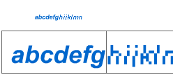
The image is a comparison of the same font (Arial Bold Italic I believe) used without and with hinting instructions (new). They maybe made the mistake of using an italic font (which is always bad on lower resolutions), but one can clearly see the hinting data is being used and that’s the technical breakthrough introduced on this Flash version.
No one will “read better pixel fonts”. Simply because there will be no difference at all anymore (Flash actually creates a “pixel font” version of the font, as discussed on these comments above).
I hope that cleared the information for you.
Great article.
While technically this is great, I think one point that is overlooked is that converting fonts from outline fonts into alised fonts will never result in a font as visually pleasing and economical as one designed from a pixel foundation.
My fonts are designed with the idea of staying true to the media. The fonts are not the one solution to design problems, but I think that when used with consideration, they work better than default aliased fonts.
Miniml fonts have a place in the design world that has nothing to do with fads. At least from my position.
Craig, you’re right; I was just touching the technical aspects of it, when using fonts to cover for the inability of rendering hinted fonts in Flash. Maybe I didn’t emphasize that enough, but I did mention there’s some original work around, and that’s why I think “pixel” fonts will never disappear, despite the article title – they’ll just lose the title of technical solution and remain as design solution.
“converting fonts from outline fonts into alised fonts will never result in a font as visually pleasing and economical as one designed from a pixel foundation.”
This is incorrect, for the simple reason that the hinting of outline fonts is done based on handmade bitmaps! So there’s no difference – or at least doesn’t have to be if the hinting is done right.
The good news? Now it’s time for handmade GRAYSCALE fonts! 🙂
hhp
Yeah, the future come, imagine not just death of bitmap fonts but ..the movies (art movies) only entirely from vectors not from bitmap frames, searcheable objects in movies (mark of a car, name of the actors).
Future have time and ..Macromedia era is just begun.
IT Future need a lot of dreamin’ work ..and
Macromedia.
well done job
People will still use flash 4/5 and swish so i guess there is still a place for pixel fonts.
That’s all well and good, but macromedia still have yet to provide the tools for type manipulation at the same standard as say, Adobe’s products. The leading control is still completely hit and miss, and the ability to set various atrributes in different units (ie. points vs pixels). Anyway, many improvements have been made none the less – my personal favourite being the history palette – at last a decent way to save time repeating labourious steps, although this still has a few glitches from what ive found in the trial.
A really interesting article. From an initial look at the new alias font feature it’s really amazing, but the results aren’t 100% reliable. I think in many cases a hand-crafted pixel font will remain a better choice -if you really want to control every pixel. There are lots and lots of fonts out there which are poorly hinted or which lack hinting entirely. The mass market for flash pixel fonts such as it was will probably suffer nevertheless.
Anyone here knows how to program using the Flash File Format SDK?
Hi,
I am boxing with the following problem:
I want to copy a text written in Arabic and then paste it onto Flash text box. Flash reverses the content of text. Any solutions to that?
I know how to work with dynamic UNICODE files. However the above question is just about to copy and paste not unicode.
Best regards,
Kiumars
http://www.web2.dk
web2@web2.dk
Hi,
I really learned a lot from this and appreciate the explanation. One thing I’m not clear on though: does the .swf have to be saved for the version 7 player to achieve the font clarity or can it be saved for version 6 if it is created in MX 2004?
Thanks.
What I tested for my own:
you need to export as flash player 7!!!
mmm it’s a pity that it isn’t supported by the 6th!!
Instead you can use PixFont the Russian software which make the same work as flash 7, but externally,
a bit less convenient…
Hope this will help!
Regards.
Hi Pixelfont-Folks,
just turning a system font into a kind of anti-anti-aliased font doesn´t do the trick. If you take a look at perfomance for larger scroll-texts you will soon discover, that pixelfonts need 2-3 times less cpu-power to let your text scroll smoothly (because of a simpler font-strukture >> less nodes etc.), and think about kerning: the flash mx 2004 alias-function creates letter-distances from 1-3 pixel where you need exactly a constant distance of 1 pixel. try it out yourselfe with frutiger on 11pt with aliase-function: looks horrible! so the problem of professional looking text in flash is not realy solved yet…
frank
ps: take a pixelfont, save money and nerves
To convert fonts to pixel fonts you can use pixfont. But also there’s now a plugin for fontlab which purpose is specificately to generate pixfotns for flash, with precise features like kerning…
It’s known as FontFlasher. PLease refer to this link for a tutorial:
http://claus.packts.net/dani/fontflasher_tutorial.php
Best regards
I’ve already wrote about FontLab’s plugin when it started development.
http://newsfeed.fatorcaos.com.br/000022.html
Then again when it was released as FontFlasher.
http://newsfeed.fatorcaos.com.br/000033.html
I’ve also wrote about other easy/free ways for creating pixel fonts and released a free template for easy pixel font creation by using FontLab tools such as FontLab or TypeTool.
http://newsfeed.fatorcaos.com.br/000032.html
Frank Szelinski said:
“the flash mx 2004 alias-function creates letter-distances from 1-3 pixel where you need exactly a constant distance of 1 pixel.”
I’ve had these same results using Lexipa. So… the problem was not solved at all. Right? I mean, please tell me if I’m wrong. embedding fonts screws up kerning, at least is some cases.
Hi,
Never posted here but it’s a great article and thread and hope somebody can help me.
Do you still have to use pixel fonts if you’re using dynamic text that needs to be masked?
(without embedding because this makes it all blurry) … or is there something that I’m missing? Quite important for what I’m doing right now so would be great if someone could help out!
thanks a lot,
Brad
“…(without embedding because this makes it all blurry) … or is there something that I’m missing?”
Hi Brad,
I think what you’re missing is the fact that you basically have to embed the font, unless it is one of the core system fonts (arial, courier verdana etc.) If you fail to do this, the swf will look fine on your machine (where the font is installed), but on any machine where the font is not installed, it will revert to a system font. This can end up looking very bad as often that font is a pixellated times new roman.
I would agree that most of the time the automated pixellation discussed here does not produce a particularly pleasing result and a purpose built pixel font is a better choice.
So for small text, either use system fonts (like verdana), and no embedding (this will look clean as it is rendered by the os) – or use
a pixel font, but make sure to embed it. A correctly made and used pixel font will not appear blurred when embedded, but to avoid blurring, text must be placed on whole number coordinates (eg 444.0 not 444.3) and scaled at exactly 100%. This can be a real gotcha when you have modified the size of a text box using the property inspector. To fix it, do a ‘remove transformations’.
101 pixel fonts